
Technology
Google Maps Redesign Faces Criticism from Users
 courtesy of bgr.com
New Colors and Clutter Impact User Experience
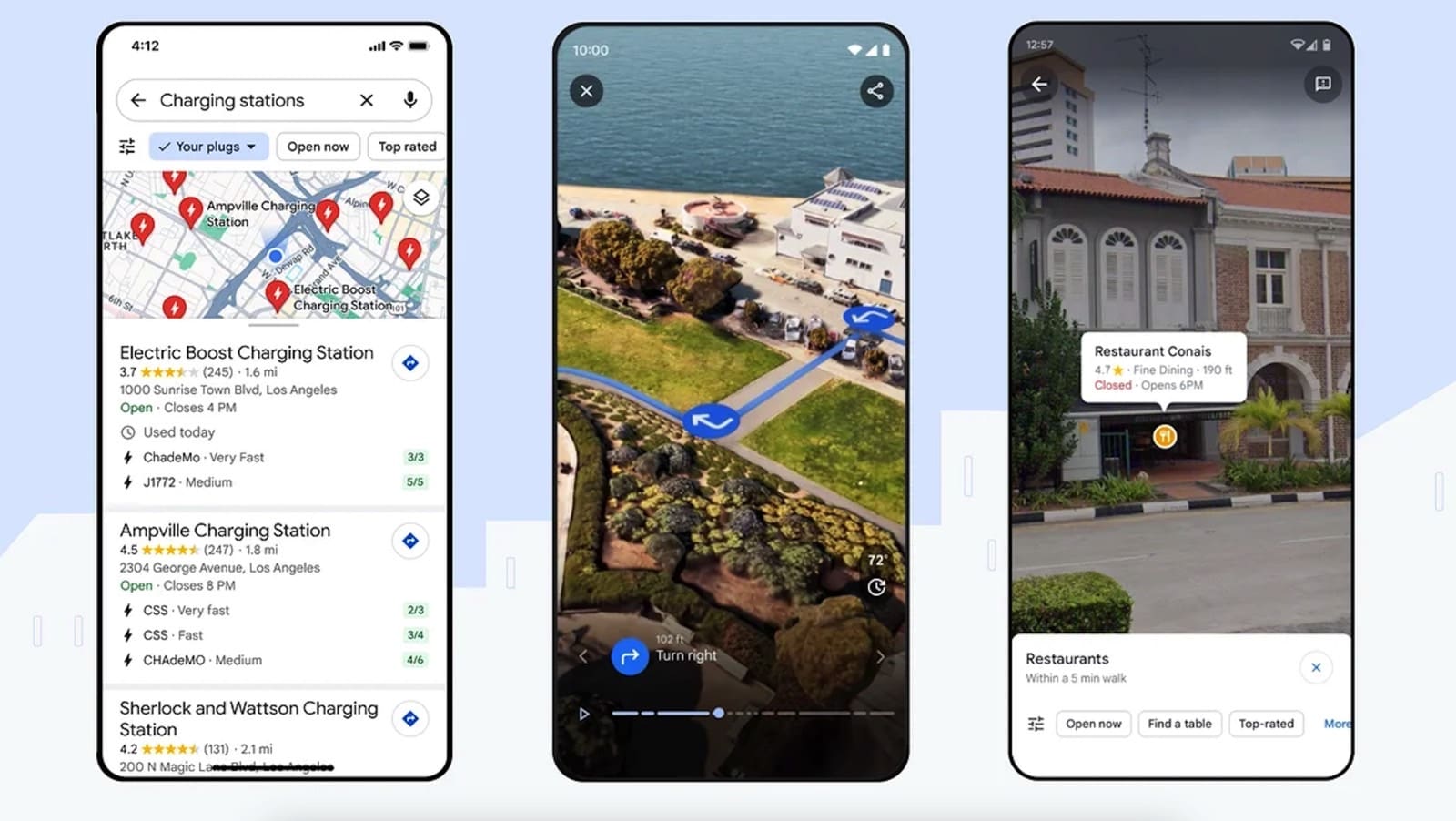
Google recently released a major upgrade to its Google Maps platform, featuring a significant redesign and new AI features. However, the new color palette and cluttered interface have drawn criticism from users, particularly longtime Google Maps users who are having difficulty adjusting to the changes.
Former Google Maps Designer Voices Complaints
One of the critics is Elizabeth Laraki, a former Google Maps designer, who took to Twitter to express her dissatisfaction with the new design. Laraki highlighted the cluttered nature of the new Google Maps experience rather than the color choices.
Missed Opportunity for Simplification and Scalability
In her review, Laraki stated that the recent redesign missed a key opportunity to simplify and scale the Google Maps interface. She suggested that the clutter on the map, including multiple overlays, hinders usability and should be minimized.
Proposed Cleaner UI
Laraki proposed a cleaner Google Maps user interface that keeps the new color palette but eliminates many of the overlays. She recommended moving most features to a redesigned bottom bar, while keeping the search bar and directions prominently displayed.
Reflecting on the Past
Laraki acknowledged that app interfaces often become cluttered over time, citing her experience as a Google Maps designer in 2007 when the app had become a "cluttered mess." She emphasized the need to prioritize simplicity and scalability for a better user experience.
Time for a Rethink
Laraki believes it's time for Google Maps to rethink its design and prioritize usability once again. With her proposed cleaner UI and a focus on minimizing overlays, she suggests that Google Maps can provide a more user-friendly and visually appealing experience.

Hey there! I’m William Cooper, your go-to guy for all things travel at iMagazineDaily. I’m 39, living the dream in Oshkosh, WI, and I can’t get enough of exploring every corner of this amazing world. I’ve got this awesome gig where I blog about my travel escapades, and let me tell you, it’s never a dull moment! When I’m not busy typing away or editing some cool content, I’m out there in the city, living it up and tasting every crazy delicious thing I can find. Join me on this wild ride of adventures and stories, right here at iMagazineDaily. Trust me, it’s going to be a blast! 🌍✈️🍴


